Thursday, May 10, 2012

Adaptive Asset Allocation: A True Revolution in Portfolio Management

Modern Portfolio Theory (MTP) has been derided by practitioners, academics, and the media over the past ten years because the dominant application of the theory, Strategic Asset Allocation, has delivered poor performance and high volatility since the millennial technology crash.

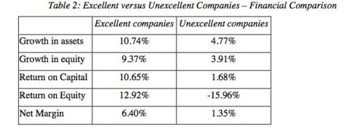
Strategic Asset Allocation probably deserves the negative press it receives, but the mathematical identity described by Markowitz in his 1967 paper is axiomatic in the same way Pythagoras' equations describe the properties of right triangles, or Schrodinger's equations describe the positional probabilities of electrons.

The math is the math.

Bear with me!

Modern Portfolio Theory requires three parameters to create optimal portfolios from two or more assets: 
  1. Expected returns 
  2. Expected volatility
  3. Expected correlation
Strategic Asset Allocation applies MPT using long-term averages of these parameters to create diversified portfolios that theoretically maximize the excess returns of the portfolio per unit of volatility.

The problem with Strategic Asset Allocation is not the math of MPT - the problem is with the assumption that the best estimates for returns, volatility and correlations are the long-term averages.

Garbage In: Garbage Out (GIGO)

GIGO: Returns

The magnitude of this error in assumptions cannot be overstated because long-term averages hide enormous variability over shorter periods which can be observed and utilized for better portfolio assembly.

Consider the following chart, which shows the range of real returns to U.S. stocks over rolling 20-year periods from 1871 through 2009. While 20 years or so approximates a typical retirement investment horizon, it exceeds, by multiples, the average psychological horizon of most investors which is much closer to 3 or 4 years.

Source: Shiller, Butler|Philbrick|Gordillo & Associates

You will note that, even over horizons as long as 20 years, annualized real returns to stocks range from -0.22% right before the Great Depression crash, to 13.61% during the 20 years ending in March of 2000.

For portfolios created using traditional Strategic Asset Allocation, this amount of variability in returns means the difference between living on food stamps after 10 years of retirement and leaving a deca-million dollar legacy for heirs. In other words, a retirement constructed using long-term average return estimates is analogous to a game of retirement Russian Roulette, where luck alone decides your fate.
Garbage long-term average estimates in: garbage portfolio results out.

GIGO: Volatility

There is a great deal going on under the surface with volatility estimates too. For example, while long-term daily average volatility is around 20% annualized for stocks, and 7% for 10-year Treasury bonds, the following two charts show how realized volatility fluctuates dramatically over time for both stocks and bonds.

S&P 500 60-Day Rolling Standard Deviation (Index points)

10-Year Treasury 60-Day Rolling Standard Deviation (Index points)
Source: Stockcharts.com

Incredibly, you can see that the volatility of a bond portfolio can fluctuate by over 1000% over a 60 day period, and the volatility of a U.S. stock portfolio can fluctuate by almost 1500%.

This has a dramatic impact on the risk profile of a typical balanced portfolio, and therefore on the experience of a typical balanced investor. Most investors believe that if a portfolio is divided 60% into stocks and 40% into bonds, that these asset classes contribute the same proportion of risk to the portfolio.

However, as the next chart shows, for a portfolio consisting of 60% S&P500 and 40% 10-year Treasuries, the stock portion of the portfolio actually contributes over 80% of total portfolio volatility on average, and over 90% of portfolio volatility about 5% of the time. In late 2008 for example, a 60/40 portfolio generally behaved as though it was over 90% stocks!

Garbage 
long-term average estimates in: garbage portfolio results out.

Source: Yahoo Finance, Butler|Philbrick|Gordillo & Associates Strategies

GIGO: Correlation

By now it probably comes as no surprise that the correlation between asset classes fluctuates substantially over time as well. While the long-term correlation between U.S. stocks and Treasuries, and U.S. stocks and gold, are low or even negative over the long-term, the actual realized correlation between these assets oscillates between strong and weak over time.


Source: Stockcharts.com

From the charts, notice that the long-term average 60-day rolling correlation between stocks and Treasuries over the 12-year period shown is -0.42, and the correlation between stocks and gold is +0.22.

However, the stock/Treasury correlation varies between -0.82 and +0.27 over the period, and the stock/gold correlation varies between -0.84 and +0.91. You could fly a 747 through those ranges, and the current correlation has an enormous impact on portfolio volatility.

Source: Butler|Philbrick|Gordillo & Associates

In fact, as you can see from the chart above, the volatility of a 50/50 stock/bond portfolio increases by 100% as correlation increases from -0.8 to +0.2, holding all else constant.
Garbage long-term average estimates in: garbage portfolio results out.
Return, volatility and diversification estimates vary widely from their long-term averages over the short and intermediate terms. Managers who do not monitor and adjust portfolios to these changes risk substantial deviation from stated portfolio objectives, and are almost certain to deliver a sub-optimal experience for investors.

The Objective of Portfolio Optimization

One of the most important axioms in finance is that the best estimate of tomorrow's value is today's value. Our prior articles in this series clearly demonstrate this important concept for returns, volatility and correlation.

Which begs the question: If we can measure the value of these variables over the recent past, and they are better estimates over the near-term than long-term average values, why don't we use current observed values for portfolio optimization instead? Why would we choose to hold a static asset allocation in portfolios when it is possible to adapt over time based on observed current conditions?

It is worth noting that the overall objective of asset allocation is to deliver the highest returns per unit of volatility. In finance, this is called the 'Sharpe ratio'*.

You may wonder why we don't we just focus on returns. Well, one reason is that higher risk portfolios are much more difficult to stick with. While we may know logically that stocks deliver reasonable long-term returns, we may find it difficult to ride out sustained losses of 50%, 60% or greater on the way to our promised long-term growth. Under such circumstances most of us will cry 'Uncle' at the wrong time and permanently harvest a large loss.

That's why in our examples below we also highlight a measure called 'maximum drawdown', which describes the maximum peak-to-trough daily loss of each portfolio over the period under investigation. Between volatility and maximum drawdown we capture a substantial portion of meaningful risk.

For those in or near retirement, when evaluating the tests below remember that higher returns alone will not improve retirement income or sustainability.  For retirees drawing income, or those within 5 years of retiring, the most important measure of portfolio performance is the returns/volatility ratio: the higher this ratio, the higher the sustainable retirement income from a portfolio.

Introducing Adaptive Asset Allocation

To illustrate the revolutionary advantage that accrues from using recent observed portfolio parameters to regularly adapt portfolios to changing market conditions, consider a portfolio consisting of 10 major global asset classes:
  • U.S. stocks
  • European stocks
  • Japanese stocks
  • Emerging market stocks
  • U.S. REITs
  • International REITs
  • U.S. intermediate Treasuries
  • U.S. long-term Treasuries
  • Commodities
  • Gold
Going back to 1995, if we held this basket of assets in equal weight, and rebalanced monthly, we would have experienced the following portfolio growth profile [Example 1].

Example 1: 10 Assets, Equal Weight Rebalanced Monthly
Source: Yahoo finance, Butler|Philbrick|Gordillo & Associates

We saw above in GIGO: Volatility above how volatile assets like stocks dominate the total risk of a typical portfolio, and the chart above provides further proof.  But what happens if we observe the actual volatility of each asset in the portfolio over the past 60 days, and adjust the allocations at each monthly rebalance period so that each asset contributes the same 1% daily volatility to the portfolio, to a maximum of 100% exposure [Example 2]?

Example 2: 10 Assets, Volatility Weighted Rebalanced Monthly
Source: Yahoo finance, Butler|Philbrick|Gordillo & Associates

By simply sizing each asset in the portfolio so that it contributes the same 1% daily volatility based on observed volatility over the prior 60 days, the return delivered per unit of risk (Sharpe) almost doubles from 0.66 to 1.23 versus the equal-weight portfolio, and the maximum drawdown is cut in half from 44% to under 20%.

This is a dramatic reduction in risk without sacrificing any returns. Aside from the reduced emotional burden this approach provides, it also
very substantially boosts safe withdrawal rates for retirement or endowment portfolios, but that's a tale for another post.

Now let's re-introduce momentum as a better return estimate. We demonstrated how assets that have risen the most over the prior 6 to 12 months tend to continue to outperform over subsequent weeks. Momentum is therefore just a better way of estimating performance over the near-term future. So let's consider a new portfolio assembled monthly from the top 5 assets out of the 10 asset basket above, based on their performance over the past 6 months. This will be our pure Momentum Portfolio [Example 3].
Example 3: 10 Assets, Top 5 Equal Weight By 6-Month Momentum, Rebalanced Monthly
Source: Yahoo finance, Butler|Philbrick|Gordillo & Associates

You can see that by holding the top 5 assets each month based exclusively on their 6-month momentum, we again nearly double the Sharpe ratio, but we also substantially increase annualized returns - from 8.36% for the equal weight to 14.30% for our Momentum Portfolio. The average volatility for the momentum portfolio is slightly lower than the equal weight portfolio at 11.6% versus 12.7% annualized, and the drawdown is 40% smaller.

Our next step is to combine estimates of return based on momentum with estimates of volatility based on recent observed volatility. The following chart shows the performance of an approach that assembles the top 5 assets by 6-month momentum, and then applies the same volatility sizing overlay as we used in Example 2, so that each of the top 5 assets contributes the same 1% of daily risk to the portfolio, again to a maximum of 100% exposure [Example 4].

Example 4: 10 Assets, Top 5 By 6-Month Momentum, Volatility Weighted, Rebalanced Monthly
Source: Yahoo finance, Butler|Philbrick|Gordillo & Associates

This technique lowers returns slightly from 14.3% to 13.7%, but the Sharpe ratio increases from 1.23 to 1.51, and the maximum drawdown drops to 16% from 26%.

The next and final step is to integrate momentum, volatility and correlation using our improved return (momentum), volatility and correlation estimates to achieve true Adaptive Asset Allocation (AAA).

A novel approach to this might be to create portfolios at each monthly rebalance based on the Top 5 assets by 6-month momentum, but allocate among the assets according to a minimum variance algorithm rather than by volatility sizing each asset individually.

The minimum variance algorithm takes into account the volatility and correlations between the Top 5 assets to create the momentum portfolio with the lowest expected portfolio level volatility. If we rebalance the portfolio monthly with this approach we achieve the following performance [Example 5.].

Example 5: 10 Assets, Top 5 By 6-Month Momentum, Minimum Variance, Rebalanced Monthly
Source: Yahoo Finance, Butler|Philbrick|Gordillo & Associates

You can see that by integrating our last factor, correlation, we are able to achieve higher returns of 15.4% versus 13.7%, and with a substantially higher Sharpe ratio of 1.71 versus 1.51, while preserving the maximum drawdown profile under 16%.

The Next Generation of Portfolio Management

While there are much better algorithms to integrate momentum, volatility and correlation, the examples above show a clear evolution of techniques that demonstrate how to integrate the three primary variables used for portfolio construction under a true Adaptive Asset Allocation framework.

Portfolios assembled using classic Strategic Asset Allocation are vulnerable to the 'flaw of averages' where long-term average values hide enormous variability over time. Quantitative Tactical Asset Allocation suffers from considerably lower returns over time, and is vulnerable to changing market character. For example, QTAA has suffered recently because the dispersion of returns around monthly moving averages has increased by multiples over the past few years.

In contrast, Adaptive Asset Allocation is robust to changes in market character because proper application uses a variety of standard parameter lookbacks for estimation. Further, volatility and correlation management, as well as more regular rebalance frequency, provides substantial tailwinds for portfolios. Lastly, AAA portfolios are always optimally diversified, which makes them robust to market shocks which wreak havoc on more concentrated tactical portfolios.

The portfolio management industry is undergoing a revolution analogous to the shift that occurred after Markowitz introduced his Modern Portfolio Theory in 1967. Managers who embrace the new methods will increasingly dominate traditional managers; those who fail to adapt will, inevitably, face extinction.

*[Geek note: Technically, the Sharpe ratio is calculated using returns in excess of the cash yield, though we use a simple return/risk ratio in this article.]

Wednesday, May 9, 2012

Intuition is for Suckers

There has been a great deal of press on Aswath Damodaran’s paper ”Value Investing: Investing for Grown Ups?” in which Damodaran asked, “If value investing works, why do value investors underperform?

This 77 page report offers plenty of grist for the mill, but one study really stood out because it highlights the problem with the first order thinking that most investors, including some of the highest profile managers, use in their security selection process.

It is a commonly held belief that so-called 'blue chip' or 'high quality' stocks will outperform over the long-term.  High quality is often defined as a function of balance sheet strength, earnings consistency, capital efficiency and margins, with companies who rank highly in these areas generally favored over companies who rate lowly. This obviously makes intuitive sense.

Interestingly however, and as so often happens in markets, the obvious and intuitive assumption turns out to be dead wrong. The following table, taken from Damodaran's paper, shows the average financial characteristics of two portfolios formed from screens of high quality stocks or 'Excellent Companies' versus low quality or 'Unexcellent Companies'. Clearly the financial characteristics of the Excellent Companies portfolio would appear substantially more attractive and, in theory, would  warrant higher returns.

Source: Clayman, Damodaran, 2012

This wouldn't be a very interesting post if the results worked out as expected, and in fact they don't. You can see from the chart below that the un-excellent companies substantially outperformed the excellent companies over the investigated period.


So what happened? You mean we can't count on strong investment performance from the companies with superior financial characteristics?

This is a good example of first order thinking. According to the report, most people examine company fundamentals and, if they are strong, assume that an investment in that company will work out well over time. Unfortunately, if everyone else is looking for companies using similar criteria, then those companies will experience a larger demand for shares. The larger demand will have already pushed the price of these stocks higher to reflect the strong fundamentals, and investors who pay higher prices for a value stock will necessarily receive lower returns over the long term.

In contrast, 'un-excellent' companies are in very low demand, which means their stocks will be relatively cheaper. In fact, the price of low quality value stocks is cheaper than would otherwise be warranted by fundamentals, because people assume that these low quality stocks will generate lower returns. As a result of their unexpectedly low prices, a diversified portfolio of these companies actually ends up delivering better long-term returns.

What can we say? No one said it was easy to make money in markets. If it were, then typical investors would be beating the market rather than lagging the markets by 3 to 5% per year, per the chart below. One of the reasons behind this disparity is that it is difficult to act against your intuition, and your intuition is often wrong because of myriad emotional and cognitive biases.

In other words, our wetware isn't equipped to make profitable choices in complex domains like the markets.

Source: Dalbar, 2012

Another important example of the fallibility of our wetware relates to the common myth that you must take higher risk to achieve higher returns. The following chart compares the returns of two portfolios: the red line reflects the performance of a portfolio formed from the most volatile U.S. stocks each quarter back to 1987, while the grey line shows the performance of the least volatile stocks.

Against all intuition, lower risk stocks outperform higher risk stocks, and by a substantial margin. Lower risk = higher return? Who'd a thunk?


While it's interesting to learn that lower risk equals higher returns in stocks, you may also be surprised to learn that stocks deliver their best performance during periods of low stock market volatility, and deliver their worst results during periods of high volatility. The chart below shines a spotlight on this effect.

Source: Yahoo Finance, DarwinFunds.ca

The chart highlights that the compound returns from stocks during periods of highest volatility delivered negative returns, while the returns during periods of lowest volatility delivered spectacular returns.

This is highly relevant because, while it is more difficult to forecast returns, it is much easier to forecast volatility. The following chart shows the near linear correlation between a monthly forecast based on a weighted average of recent monthly market volatility, and the actual market volatility realized over the subsequent month.

Source: Falkenblog

Given that we can effectively forecast volatility, and periods of high volatility generally correlate with periods of lower returns, imagine what we can achieve by lowering exposure when forecast volatility is above a certain threshold, and increasing exposure when forecast volatility is below the threshold.

To see how we integrate this technique and other concepts into our portfolio management approach, please visit us online at DarwinFunds.ca.

Tuesday, May 8, 2012

Diversification: Still the Only Free Lunch

Diversification is a familiar term to most investors because it refers to the age-old concept of “don’t put all your eggs in one basket.” But the benefits of diversification can only be understood through a deeper understanding of the concept of correlation.

Correlation defined

Imagine a flock of birds in the sky, or a school of fish swimming together in the ocean. While each group contains individuals that can make their own decisions, as a group, they tend to move in the same direction almost simultaneously. It is visually striking to watch them move together in near perfect unison as if they were connected by invisible strings. In fact, we can describe the relationship between the birds or the fish as having a nearly perfect correlation. The degree to which the individuals in the group are connected is a function of their correlation.

It is easy to visualize portfolios of individual stocks as being just another example of group behaviour. At times, the individual stocks move together in perfect unison like a flock of birds, and at other times they seem to go in their own direction. Correlation is quantified via a statistic called the Correlation Coefficient, which varies between -1 (moves in opposite directions) and +1 (moves in the same direction). A coefficient of 0 indicates no relationship.

A common misconception is that two securities with a perfect negative correlation will cancel each other out, leaving a portfolio return of zero, but this is not the case. Correlation describes the degree to which two securities deviate in the same direction from their individual average returns. In this way, two securities can be perfectly negatively correlated (coefficient of -1) but also move in the same general direction over time.

Stocks and bonds provide an intuitive example of this phenomenon. Both stocks and government bonds exhibit positive average long-term average returns, but they are negatively correlated over the long-term. In this way, while the average volatility of stocks is 20 percent and the average volatility of bonds is 12 percent, the long-term realized volatility of a 50/50 stock and government bond portfolio is 10.6 percent rather than16 percent, which is the arithmetic average of the two securities (see chart).


In fact, the mathematical relationship between volatility and correlation was the breakthrough that landed Harry Markowitz his Noble Prize in Economics. From this equation it can be demonstrated that portfolio volatility always declines as correlation trends from +1 to -1, and volatility is eliminated entirely when correlation reaches -1 (see table).


In our article on volatility, we demonstrated how managing exposures to individual securities to control volatility resulted in higher absolute and risk-adjusted returns for a variety of asset classes. You can see how correlation and diversification can be applied at the portfolio level by measuring and allocating to assets within portfolios purely on the basis of correlation.
Unfortunately, in practice, most Portfolio Managers make long-term assumptions about correlations between assets. But actual correlations between assets can vary widely over time. Thus, it makes sense to constantly observe the actual correlation over time and adjust the portfolio accordingly. In the chart below, we see the actual historical 60-day rolling correlation between the S&P 500 index and Gold through 2011. Notice that the correlation statistic trends up and down over time, and is persistent over short time periods like days and weeks.


The observed correlation over the recent past can be measured and used to inform the relative allocations to securities in order to target a certain portfolio risk. By widening the scope to other major asset classes and tracking them, we have found that we can observe changes in the correlations to create lower-risk portfolios than are traditionally available to investors without sacrificing returns.

To illustrate, the chart below displays two fictitious portfolios whose investment universe is composed of the 10 major global asset classes ( Commodities, Emerging Markets, Japan, Gold, US Real estate, Europe, International Real Estate, 20-Year Treasuries, Global Equities. ). The red line represents an equal weight portfolio of the asset classes rebalanced monthly. The blue line represents a monthly rebalanced portfolio using a Minimum Correlation algorithm. The method is similar to the Minimum Variance algorithm that has become well-accepted by sophisticated practitioners and academics. While Minimum Variance focuses on minimizing total portfolio risk,  the Minimum Correlation algorithm focuses on maximizing diversification by holding non-correlated assets with an optimal weighting scheme.


The returns of the minimum correlation portfolio are 14.54 percent compared to 8.45 percent of the equal weight portfolio. More importantly, the annualized volatility comparison is 8.45 percent versus 12.94 percent respectively. Both the absolute and risk-adjusted returns were substantially improved by harnessing the power of correlation.

All chart sources: Yahoo Finance.

Thursday, May 3, 2012

Excess Returns with Momentum

“[Momentum is] the single largest inefficiency in the market. There are plenty of inefficiencies, probably hundreds. But the overwhelmingly biggest one is momentum.” — Jeremy Grantham

Momentum defined

In its simplest form momentum can be defined as the continuation of existing trends in the market, where increases in prices are followed by additional gains, and decreasing prices are followed by further losses.

Why it exists

While momentum is an investment strategy with strong empirical roots, it is helpful to think of it as a natural extension of actual human behaviour. For many years, scientists in disciplines as seemingly unrelated as evolutionary anthropology and modern psychology have demonstrated that humans are prone to the same herding instincts as other animals. That is, when faced with a choice in the absence of trusted information, humans will usually choose to follow the crowd rather than act against it.

The dominant investment paradigm embraced by almost all contemporary investors emphatically denies that this human condition exists, preferring to think of human decision makers as computational engines that operate independently and have a perfect understanding of the odds. In contrast, smart investors recognize that one of the most powerful forces in human decision-making is 'social influence', and work to take advantage of this human condition to deliver out-sized performance over time.

Enter momentum analysis

To illustrate the persistence of the momentum phenomenon over time we compare four fictitious portfolios whose investment universe is comprised of the 10 major global asset classes (U.S., European, Japanese and emerging market stocks; commodities; gold; U.S. and international real estate, and; Treasuries (intermediate and long).

At the end of every month we rank each asset class based on their six-month trailing returns. Then we adjust the holdings of each of the four portfolios based on the rankings: the first portfolio will only invest in the two top-ranked asset classes of that month, the second portfolio will hold the top half(5), the third will hold the worst half and the final portfolio will hold the worst two. These positions are further adjusted for volatility (refer to our separate Volatility Analysis report).

If, as many experts say, the markets are indeed efficient, and the movements of risky assets are random in nature, then the returns of these portfolios should reflect this randomness and this ranking mechanism should have no effect. What we observe, however, is a different story altogether.


In reality the best performing portfolios by far were those with the highest momentum. Of course, any avid Efficient Market Hypothesis practitioner would question whether this type of simple, but actively managed strategy is capable of outperforming an even simpler buy-and-hold investment portfolio. The chart below compares the top two momentum portfolio against an equally held portfolio of all 10 asset classes rebalanced monthly.


Again we see here the vast difference in return and risk characteristics. The top two momentum portfolio grew at 21.13 percent a year vs buy-and-hold at 8.9 percent. On the risk side we see the largest peak-to-trough loss being -19.42 percent versus -43.90 percent respectively. All of this without forecasting or having to read a single analyst report, that is the power of momentum.

Market inefficiencies are often fleeting and difficult to exploit with any success over long periods of time. By its very nature the market tends to find anomalies  and eliminate them in due course. Momentum, however, seems to fly in the face of this reality. This is because as long as markets are driven by behaviourally flawed participants that make decisions based on herding, this phenomenon will continue to persist and we will be able to exploit it.
With this final step, in combination with active diversification (link coming soon) and volatility management, we are able to offer one of the most  stable and adaptive wealth management systems available to anyone today.
While uncertainty still reigns supreme in global financial markets, our Darwin Strategies provide an optimal solution for surviving the treacherous markets of the future. To learn more, contact us at www.darwinfunds.ca.

Wednesday, May 2, 2012

How to Beat the Market, and Why Most Investors Don't

Despite the thousands of mutual funds and Advisors all purporting to offer a better approach to investing, it is universally acknowledged by practitioners and academics alike that two factors represent the most persistent and universal methods of capturing excess returns in markets:
  • Value factor: Cheaper companies tend to outperform the market over the next 5 years or so.
  • Momentum factor: Companies that have performed the best recently tend to outperform the market over the next few weeks or months. 
The chart below shows how the portfolios created using the traditional Value and Momentum factors have delivered above-average returns versus a buy and hold portfolio over the period from 1927 through 2011. Note that the momentum portfolio delivers excess returns of 3.9% per year while the value portfolio beats by 2.1%.

Source: Kenneth French Data Library

The research clearly shows that the momentum anomaly offers the greatest opportunity for outperformance. Further, this anomaly extends outside stocks to asset classes and even residential real-estate. The following chart from our two-page report on momentum shows how holding the top 2 and top 5 asset classes (out of 10 global asset classes) based on recent price performance (momentum) crushes portfolios consisting of the bottom 2 and 5 asset classes.


Source: Yahoo Finance, Butler|Philbrick|Gordillo & Associates

The overwhelming challenge for most investors is that, while these factors obviously work universally over time, they do not work all the time. In fact, as the chart below clearly shows, each of these factors periodically under-performs over periods as long as several years.


Source: Kenneth French Data Library, 
Butler|Philbrick|Gordillo & Associates

Unfortunately, it is very difficult to stick with a manager who under-performs despite the overwhelming evidence of the long-term efficacy of their value or momentum approach. This inevitably compels investors to move their portfolios from manager to manager chasing whichever factor has worked the best recently.

The following chart shows the average investor holding period for each category of mutual funds over the past 20 years. Note that the typical 3 to 4 year holding period shown below is generally insufficient to realize the majority of benefits from either a value or momentum approach, especially when most investors flock to a new strategy only after it has already delivered substantial recent outperformance.


Source: Dalbar, 2012

The negative impact of these portfolio switches to actual investor performance is staggering. The chart below, also from Dalbar shows how the average balanced investor has under-performed stocks by 5.69% per year and bonds by 4.38% over the past 20 years, and failed to keep up with inflation.


Source: Dalbar, 2012

It’s important to note that this tendency to herd is a universal human trait that can only be overcome with the acceptance that in markets, our instincts are ultimately destructive. As humans, we are hardwired to make the wrong investment decisions in the absence of a disciplined and systematic investment process. 

The lesson is quite simple: When you find a factor that is proven to work over the very long-term, and a manager who is committed to systematically harnessing that factor, stick with him through thick and thin!

For more information on the most persistent and pervasive excess return factor in markets, along with two other powerful techniques - volatility management and active diversification - just click the associated links!

Volatility Management for Better Absolute and Risk-Adjusted Performance

In financial markets, few things are as predictive as volatility; it has been well documented that the best predictor of tomorrow’s or even next month’s volatility is today’s volatility.

The importance of this becomes evident when we consider how this fact can help keep portfolio risk levels constant throughout the investment horizon. If indeed today’s volatility predicts tomorrow’s volatility, and today’s volatility exceeds our predetermined risk levels then we can easily adjust our risk by reducing our position sizes dynamically.

We illustrate this concept in the chart below.


Source: Yahoo Finance, DarwinFunds.ca

The lighter blue line represents the returns in the S&P 500 if we had bought and held it from 2004 to 2011. The darker line is also an investment in the S&P 500 but here we systematically add a larger cash component to the portfolio as daily volatility increases. In fact, our goal is to keep our daily volatility levels the same, regardless of market conditions, at no more than one percent a day or 15 percent a year. Changes in volatility are depicted by the heat bar at the bottom, the brighter the red the higher the volatility and consequently the larger the cash component. 

What we observe is that this simple concept of sizing positions based on yesterday’s volatility is enough to outperform buy-and-hold by 125 percent while also keeping volatility constant at around one percent a day, even during October of 2008 where S&P 500 volatility went as high as 7.11 percent.

To illustrate further, this graph highlights some of the major events leading to the credit crisis and the corresponding cash position required when using this basic approach. As we can see, large cash positions of up to 84 percent were necessary in order to keep daily volatility constant at our target of one percent.

Source: Yahoo Finance, DarwinFunds.ca


What is also obvious is that this type of risk management not only helped keep portfolio risk consistent but also aided quite substantially in providing better absolute and risk-adjusted returns over time.


To further illustrate the relationship between returns and volatility, we compare market compound returns during periods of high volatility versus periods of low volatility. In the bar graph below, we divide the volatility of the S&P 500 into quartiles from highest to lowest and assign them to their corresponding market return.
Source: Yahoo Finance, DarwinFunds.ca

We can clearly observe how markets seem to perform best during the periods that are more predictable and less volatile. It then follows that we should focus on reducing our allocations to asset classes that are exhibiting erratic behaviour and increasing our allocations to those asset classes that exhibiting calmer and more predictable behaviour. This is a more optimal portfolio management approach given that it works across all types of asset classes as we can see from the graphs below.

Volatility analysis is the cornerstone of our portfolio management process and the one that is the most likely to persist through time. When used in combination with correlation and momentum analysis, it creates one of the most robust and consistent wealth management tools available to us.


While uncertainty still reigns supreme in global financial markets, our Darwin Strategies provide an optimal solution for surviving the treacherous markets of the future. To learn more, contact us here.

Tuesday, May 1, 2012

U.S. Stock Market Factor Portfolios: Momentum and Value

I searched Google for an hour to find this chart and eventually decided to create it myself. This charts the performance of 3 portfolios of large-cap U.S. stocks:
  1. The momentum portfolio consists of the top performing 30% of stocks over the prior 12 months (with a skip-month) rebalanced monthly.
  2. The value portfolio consists of the cheapest 30% of stocks based on price-to-book value, rebalanced annually.
  3. The buy-and-hold portfolio consists of the largest 30% of stocks based on market capitalization, rebalanced annually.
It is universally acknowledged by practitioners and academics alike that the value and momentum factors are the two most persistent and universal methods of capturing excess returns in markets. This chart illustrates the impact of these two factors on U.S. stocks, but they apply to all markets everywhere.

Source: Kenneth French Data Library. Click image for larger version.